Bridge Space
Concept Website redesign
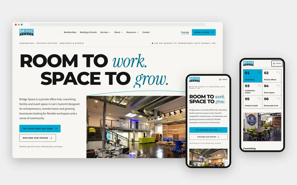
A coworking hub in a 1962 post office, rebuilt as a fast, accessible, editorial website.
This is a concept redesign: I designed and built it to show what the Bridge Space website could become.
01The project
Overview
Bridge Space is a coworking space, private office hub and event venue in downtown Lee's Summit, Missouri, housed in the town's former post office. The building was dedicated in 1962, and Bridge Space opened there in 2018.
Its old website ran on a page builder and had drifted: placeholder text in its galleries, out-of-date prices, broken links from old articles and heavy pages. I rebuilt it from the ground up, keeping the brand, the real photography and every page address, and gave the building's history a starring role.
- Status
- Concept redesign, October 2026
- My role
- Site audit, content and SEO migration plan, art direction, design system, front-end development, motion design, accessibility, QA
- Industry
- Coworking and flexible workspace
- Location
- 210 SW Market St, downtown Lee's Summit, Missouri (Kansas City area)
- Year
- 2026
- Stack
- Next.js 16, React 19, TypeScript, Tailwind CSS 4. Statically generated and set up for Netlify hosting, with 4 runtime dependencies and no animation library.
- Preview
- See the preview (hidden from search engines)
- Credits
- Photography, video and logo: Bridge Space. Fonts: Montserrat and Source Sans 3 (Bridge Space's existing brand fonts), and Instrument Serif.
02Before
The challenge
What I found on the live site before starting:
- Template placeholder text ("Slide title", "Write your caption here") under the photos in all four galleries on the Meetings & Events page.
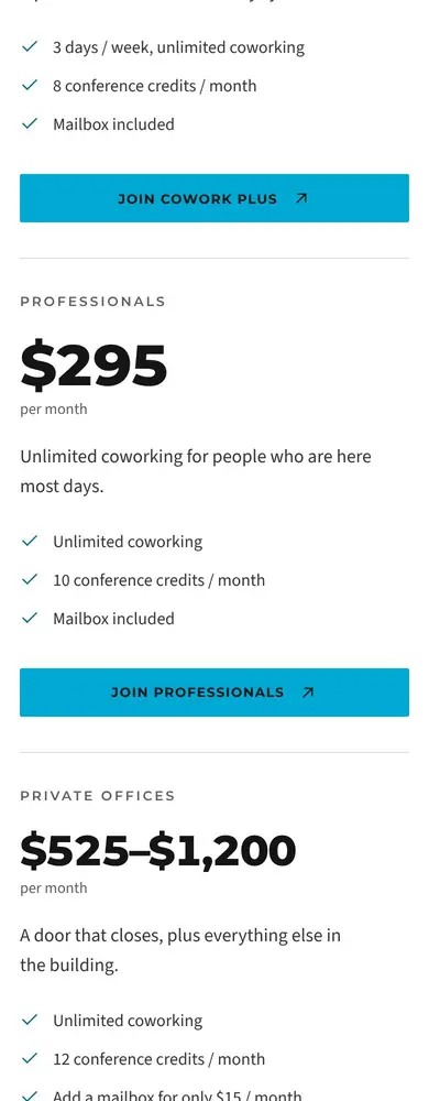
- The Kansas City coworking page still showed old prices ($75, $175 to $250, $395, $475 to $1,075) that no longer matched the memberships page ($65, from $99, $295, $525 to $1,200).
- Old blog articles linked 12 times to a page that no longer exists.
- Heavy pages: more than 20 font families requested, and photos of 1 to 5 MB each.
- The same facts told differently on different pages, such as 3, 5 or 6 conference rooms.
- 24 pages and 191 articles with years of search history that had to survive the move.
03How I worked
Approach
Audit before design
I inventoried every page, photo, video, booking link and form, pulled the exact brand colors from the old theme and logo, and checked every price and fact against the live site. Where pages contradicted each other, I flagged it for the owner instead of guessing.
Keep the brand, raise the craft
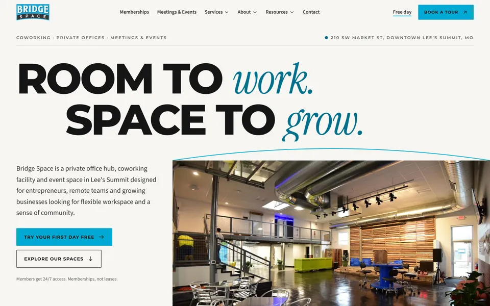
The original logo, brand cyan (#00A9D3) and charcoal (#343534), and the brand fonts stay. An editorial serif accent and a stricter grid make it feel art-directed rather than templated.
Tell the building's story
The space selector is laid out like the brass post office boxes in the lobby: six numbered doors, each opening one space with real photos, sizes and prices. A rotating "Post office 1962 · Bridge Space 2018" postmark and a thin cyan "bridge" arc tie the visuals to the place.
Make choosing easy
Memberships are laid out as a clear ledger and a side-by-side table, with the activation fee shown up front, plus a three-question plan finder that suggests a plan and says plainly that it is a suggestion, not a quote.
Real bookings, nothing faked
Every button goes to Bridge Space's existing sign-up, room calendar, event inquiry and tour booking systems. Forms only show "sent" once a message has actually been delivered.
04The look
Design and motion
- Brand cyan
#00A9D3 - Charcoal
#343534
Type: Montserrat and Source Sans 3 (the brand fonts), with Instrument Serif as the editorial accent
- An oversized headline with a staggered reveal, the building's own B-roll as a background video on larger screens (with a pause button), and a still photo on phones.
- A scroll-driven story ("One building. Five ways to work.") where the photo stays in view while the chapters change. On phones it becomes a simple vertical sequence.
- Clipped image reveals, gentle parallax and a word-by-word statement, all built with CSS and one small scroll engine, not an animation library.
- Every effect switches off for visitors who ask for reduced motion, and all page content is server-rendered HTML that search engines can read.


05The SEO
SEO migration
A redesign can wipe out years of search history if page addresses change without a plan. The method is in my guide to redesigning a website without losing your Google rankings, and it is the core of my redesign service.
- pages and articles with years of search history, every address kept
- 24 + 191
- permanent redirects for old and legacy links
- 23
- Every existing page address kept, plus 23 permanent redirects for old and legacy links.
- Unique titles, descriptions and canonical tags, one H1 per page, and structured data for the local business, breadcrumbs, articles and the FAQ.
- An XML sitemap, robots rules, and preview links automatically hidden from search engines.
06Lab tests
Results from lab tests on the finished build
- 100Lighthouse accessibility, best practices and SEO, on every page tested
- 100Lighthouse desktop performance, on all 7 pages tested
- 92 to 98Lighthouse mobile performance
- 0 to 0.001layout shift (CLS) on every page tested
- 0automated accessibility violations (axe-core, WCAG 2.2 AA rules) across 29 pages, desktop and mobile
- 320 to 1920pixels wide, with no horizontal overflow on any page
- 15 of 15form tests passed
- 4runtime dependencies, and no animation library
These are lab tests on the finished build. They are not live traffic or conversion results, and there is no before and after comparison with the old site's scores.
07The screens
Gallery
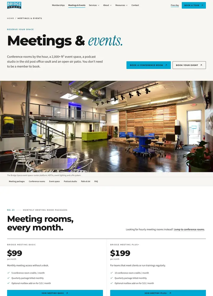
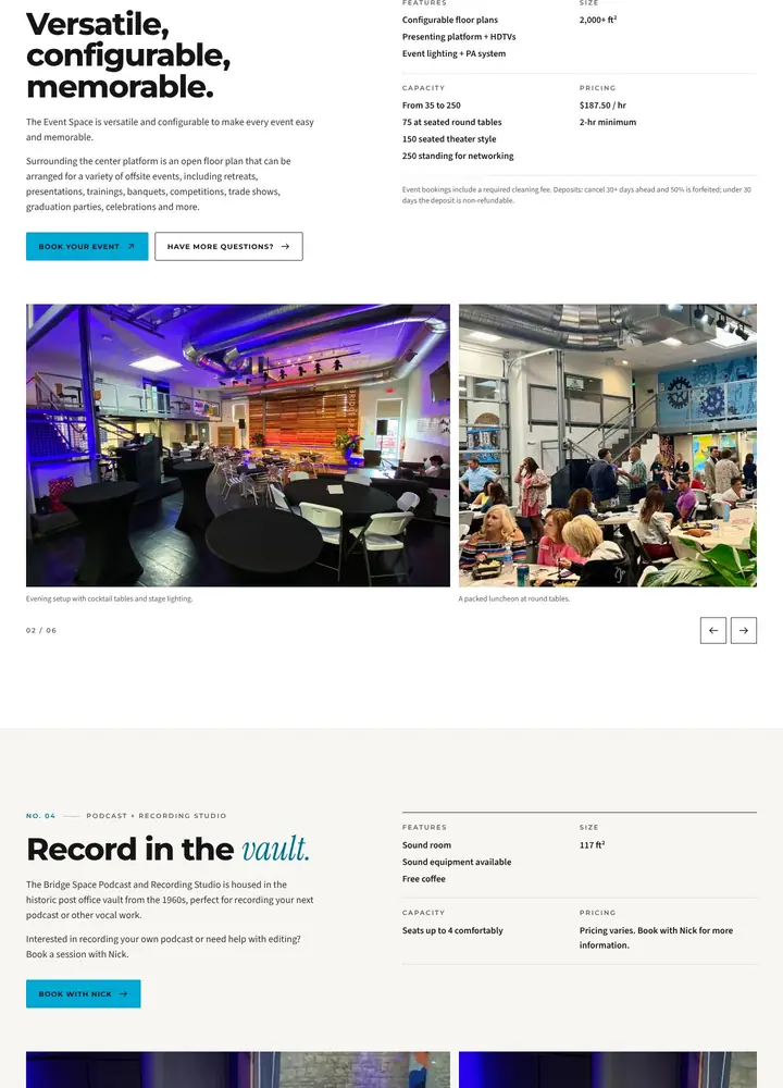
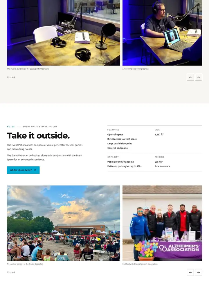
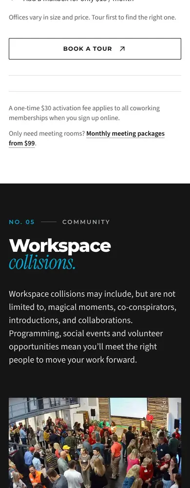
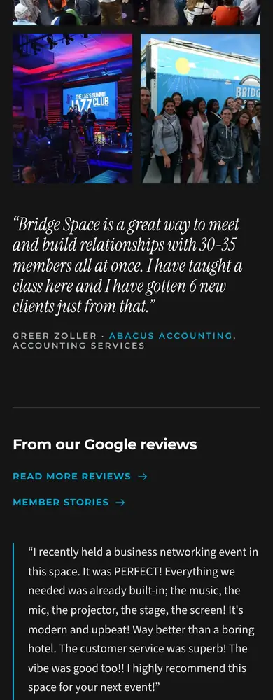
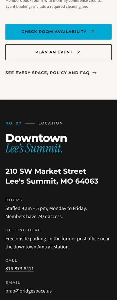
Desktop and phone screenshots of the finished build. The photography, video and logo in them belong to Bridge Space.
Homepage

Memberships


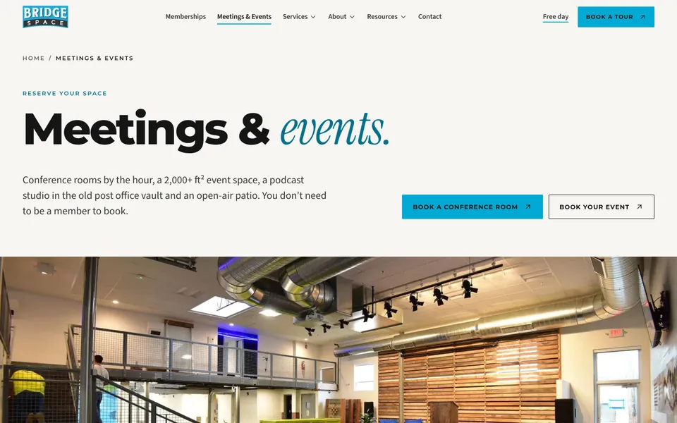
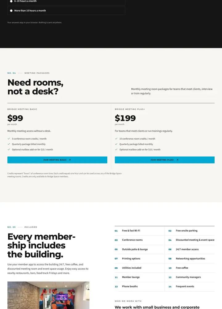
Meetings & Events


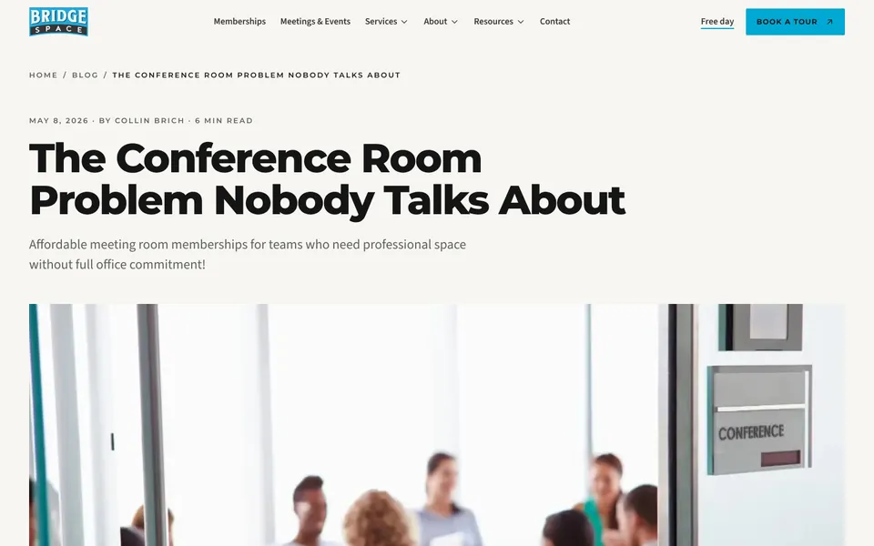
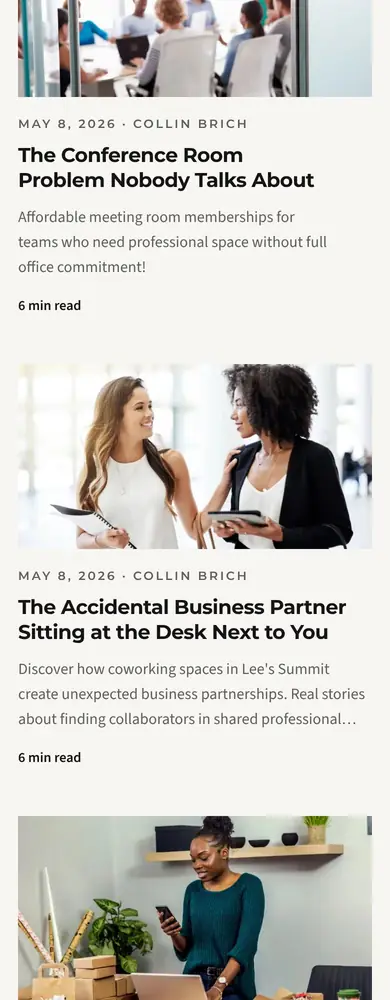
About and the blog

On phones
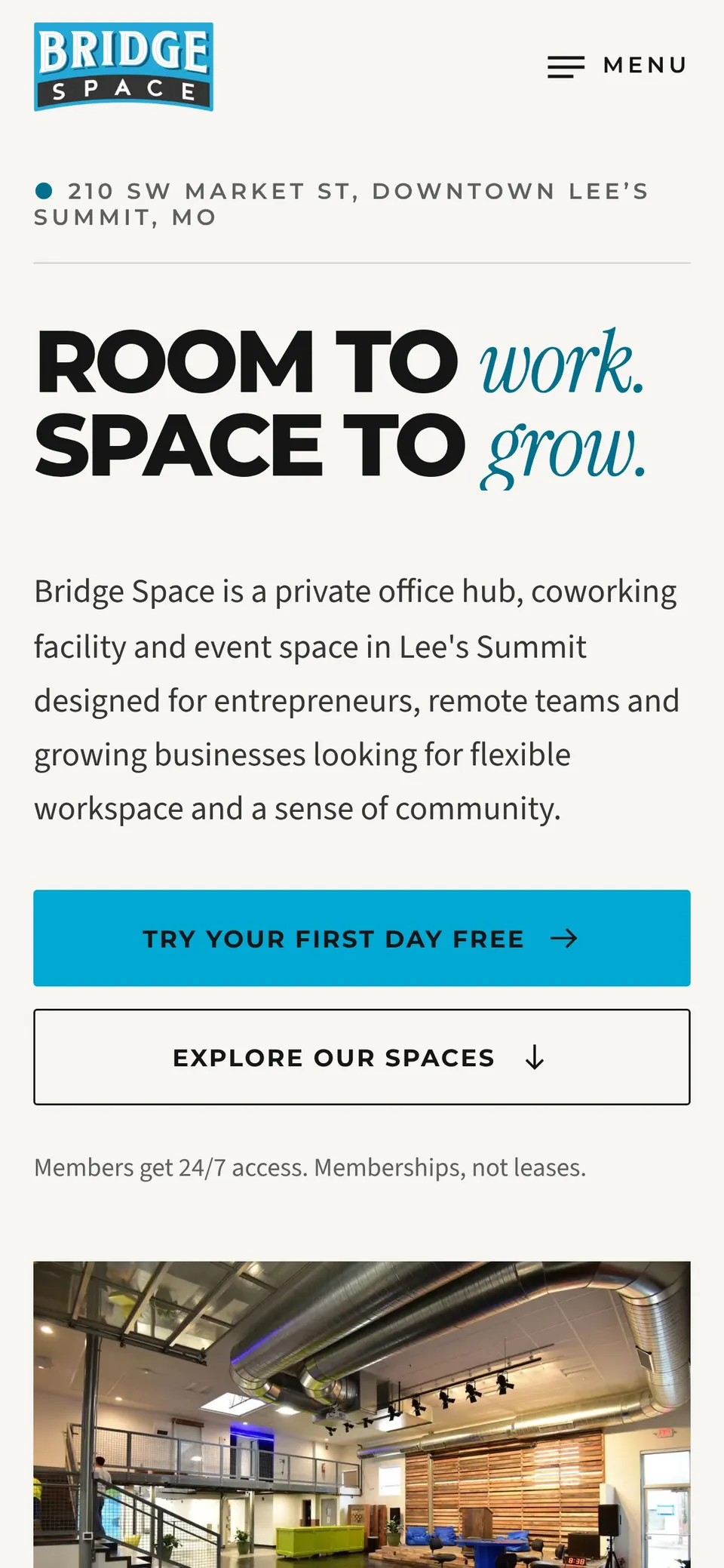
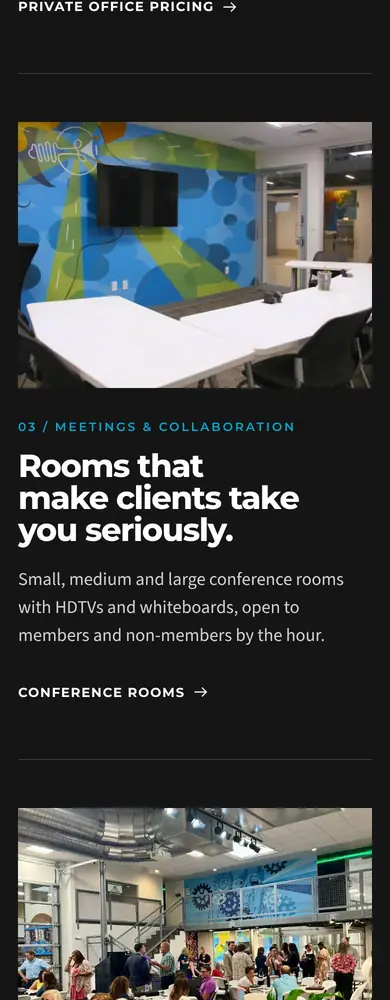
Designed for phones, not shrunk 
A full-screen mobile menu with large tap targets 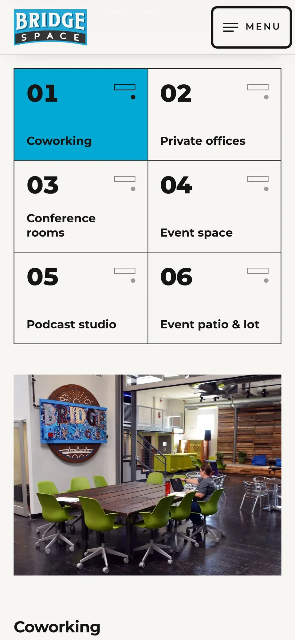
The space finder on a phone 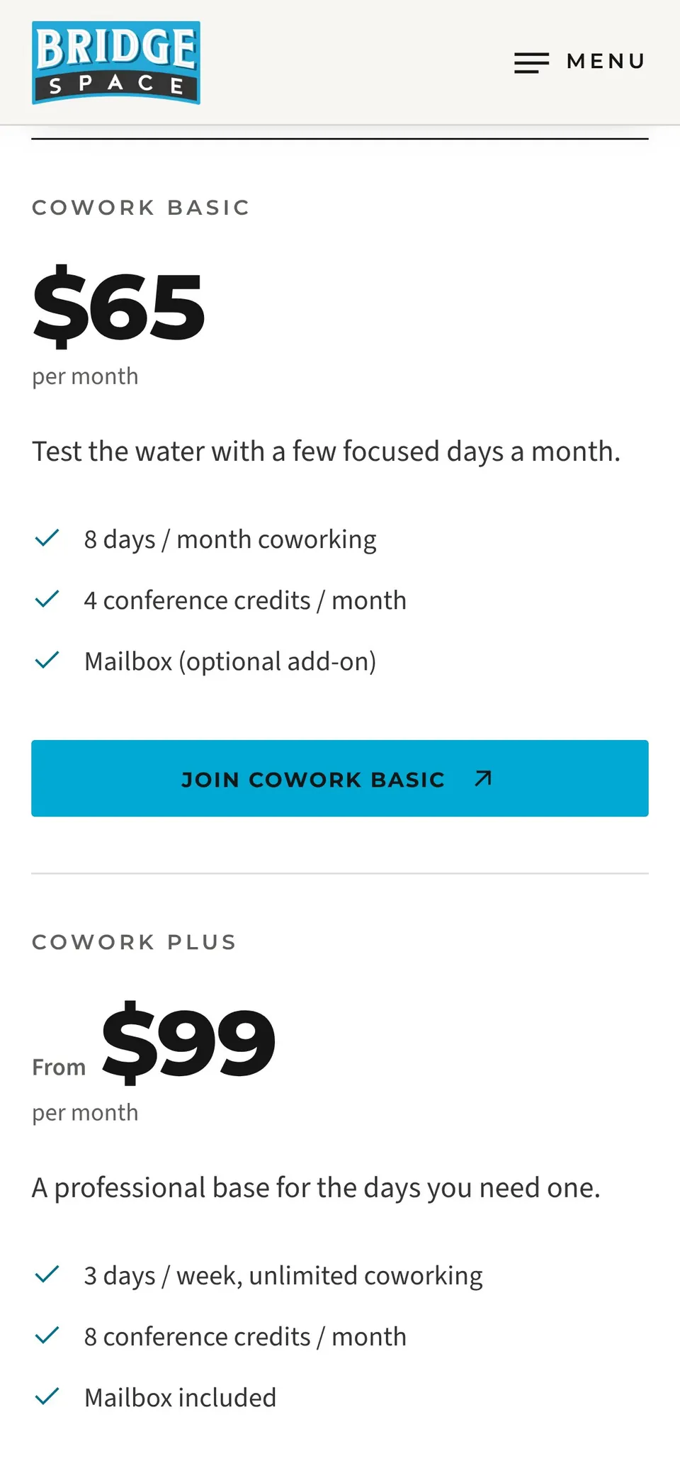
Pricing that stays readable on mobile 
Meetings & Events on mobile
Full pages
Each frame scrolls on its own, so you can read a whole page without leaving this one.














Want your website rebuilt like this?
I plan the SEO migration before the design, so every page address and its search history is accounted for. Book a call, or send me a message about your site.
Related
Tell me about your website
A 20-minute video call, no slides and no pressure. Bring your current site or your plan, and you'll leave with the three changes I'd make first, whether or not we work together.
Not ready to talk? Get a free video review of your site, or email hello@rankbuiltstudio.com.