ConceptConcept siteA fictional software product
Daywright: A B2B SaaS website where the product is the hero
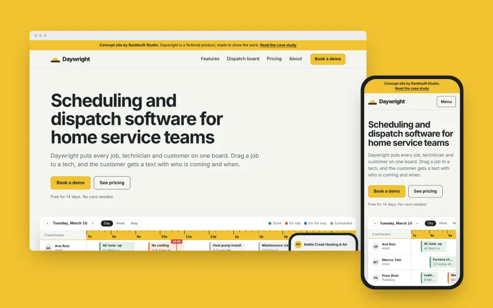
Daywright is a fictional scheduling and dispatch app for heating, plumbing and electrical companies. I gave it a name, a brand and a full marketing site to show how I build for software companies: the product on the page, pricing written down, and one clear next step.
Concept site: I designed and built it for a fictional product to show how I would build a B2B SaaS website.
 Designed, built and written by Md Rafiul Alam
01The project
At a glance
A complete software marketing site, built the way I would build one for a client, for a product that does not exist.
- Product
- Daywright, fictional scheduling and dispatch software for home service teams
- Who it is for
- Owners and dispatchers at heating, plumbing and electrical companies with 3 to 50 technicians
- What I made
- Name, logo and copy, 6 pages and a 404, product screens built in HTML and CSS, structured data, accessibility and speed work
- Built with
- Plain HTML and CSS, generated by a small Node script, no dependencies
- Timeline
- Designed and built in November 2026
- Concept site
- rankbuiltstudio.com/concepts/daywright (opens in a new tab)Hidden from search engines, and its forms send nothing
- Service
- Launch site
- Industry
- B2B SaaS
02The brief
What the site had to do
Buyers of field service software are busy owners and dispatchers. They want to see the screen they would use all day, know what it costs per technician and talk to someone who understands a service business. Many software sites hide all three behind a form.
The brief I set:
- Show the product. Put a real-looking dispatch board on the home page, with sample data, not an abstract illustration.
- Pricing on the page. Prices per technician, what each plan includes and the terms buyers usually have to ask sales about.
- One next step. Book a demo, everywhere, with the trial starting from the demo.
- No borrowed credibility. No customer logos, testimonials, user counts or "save hours every day" claims, because the product is fictional.
- Fast with heavy visuals. Product screens usually mean big screenshots. Build them in code so they stay sharp and light.
03Search
The page plan
Each page has one search to win. A live product would add use case, comparison and integration pages and a docs section, as in my SaaS playbook; this concept builds the core.
- A feature page for the main search. The dispatch board gets its own page: a full board, how dispatchers use it, clash warnings, keyboard shortcuts and its own FAQ.
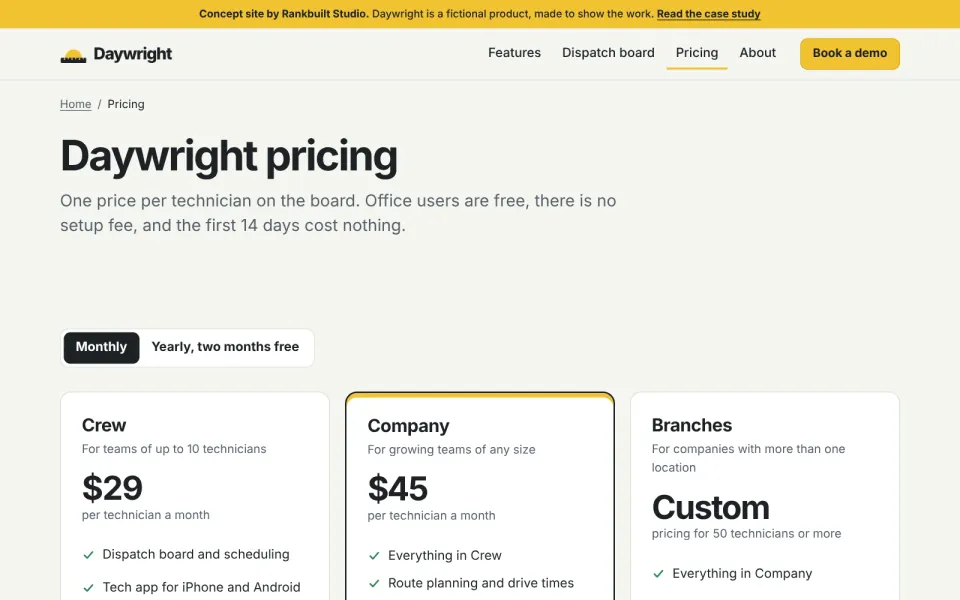
- A pricing page that answers the questions. Who counts as a technician, setup fees, contracts and the trial, all on the page and in the FAQ.
- Product, pricing, demo. Every page leads to the demo, and the pricing page links back to the features.
Pages and the searches they target
| Page | Address | Target search |
|---|---|---|
| Home | /concepts/daywright/ | scheduling and dispatch software |
| Features | /concepts/daywright/features/ | field service management software features |
| Dispatch board | /concepts/daywright/features/dispatch-board/ | dispatch board software |
| Pricing | /concepts/daywright/pricing/ | field service software pricing |
| About | /concepts/daywright/about/ | daywright |
| Book a demo | /concepts/daywright/demo/ | daywright demo |
04The markup
Structured data for a software product
The product is a SoftwareApplication made by an Organization, with its prices as offers. Google shows its software rich result only with ratings or reviews, and a new product has none, so none are invented; the markup still describes the product and its prices exactly. What schema markup is, in plain English.
SoftwareApplication- Daywright: what it does, its category, the systems it runs on and its main features.
AggregateOffer- The price range per technician per month, on the home and feature pages.
Offer and UnitPriceSpecification- Each plan, monthly and yearly, on the pricing page, priced per technician.
Organization- The company that makes it, tied to the product as its publisher.
FAQPage and BreadcrumbList- The questions on the home, dispatch board and pricing pages, and the trail on every inner page.
Left out on purpose- No AggregateRating, Review or customer logos, because there are no customers.
05The look
A tool for the trades
- Drafting paper
#F4F5F1 - Graphite
#1D2226 - Tape yellow
#F2C230 - Route blue
#2D62D8 - Copper
#C0612A - Signal green
#2F8A57
Type: the system sans (Segoe UI, San Francisco or Roboto)
The yellow of a tape measure on graphite and drafting paper, with the four job statuses (done, on site, on the way and scheduled) as the only other colors. The visitor's own fonts, so nothing is downloaded.
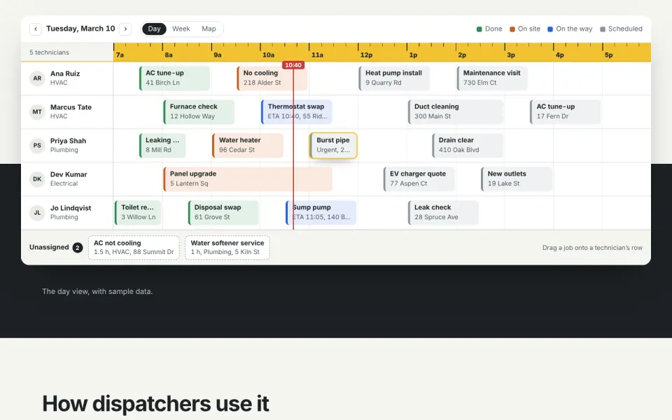
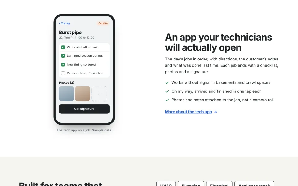
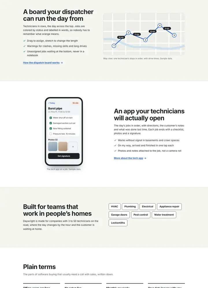
The product is the hero, and every product screen is built in HTML and CSS: the dispatch board, the tech app, the customer's text messages and the route map. They are a few kilobytes, sharp on every screen and readable by screen readers as one described image each.
The hours on the board are a tape measure, and the same tape returns wherever time is shown. The logo is a sun rising over one.
- Flat surfaces with thin borders. The board is the only lifted object on the page.
- Pricing switches between monthly and yearly with CSS alone.
06Conversion
How the design turns visits into demos
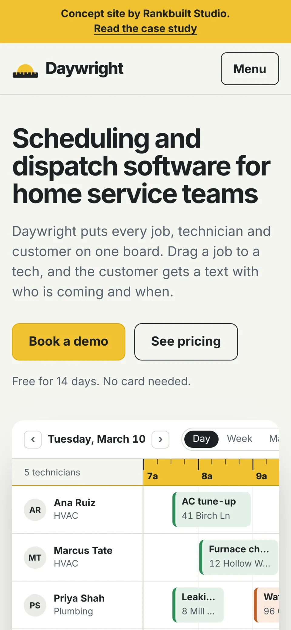
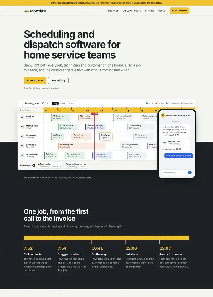
- The product in the hero. A dispatch board for a sample company: five technicians, a day of jobs colored and labelled by status, the time now and two unassigned jobs. On phones it scrolls sideways inside its frame.
- One moment of motion. An urgent job drops onto a technician's row, then the customer's "on the way" text arrives. It plays once, and not at all for anyone who prefers reduced motion.
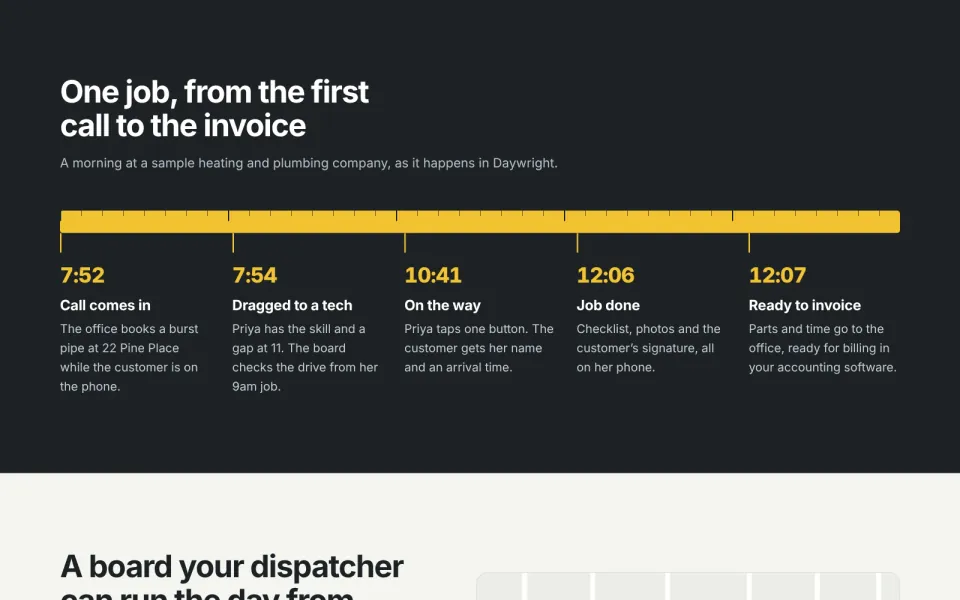
- A morning on a tape measure. One job from the first call at 7:52 to the invoice at 12:07, laid along a tape measure, which is also how the board shows the hours.
- A short demo form. Name, work email, company, team size and trade, with what happens on the call written beside it.
07Trust
Trust without fake proof
- Plain terms. Office users are free, no setup fee, monthly or yearly, and your data leaves with you, stated on the home page.
- Status in words, not just color. Every job and warning says what it means, so the screens work for people who see color differently.
- Sample data, labelled. Every product screen says it uses sample data. The company in them, Kettle Creek Heating & Air, is made up.
- How data is looked after. Encryption, two-step sign-in, backups, roles and exports, on the about page.
08The screens
More of the concept
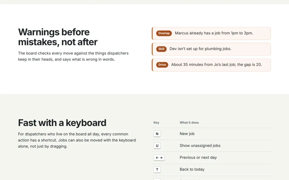
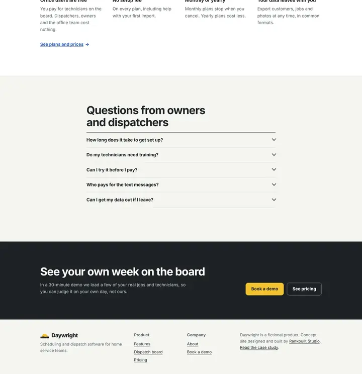
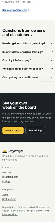
Desktop and phone screenshots of the built pages, and the whole home page top to bottom. Every product screen uses sample data.
The tech app
On phones
The home page 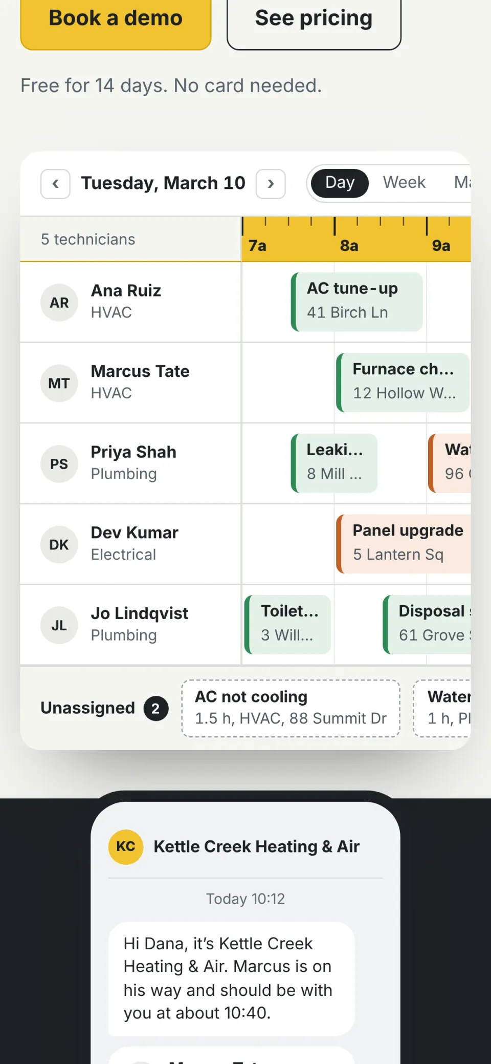
The board, scrolling sideways 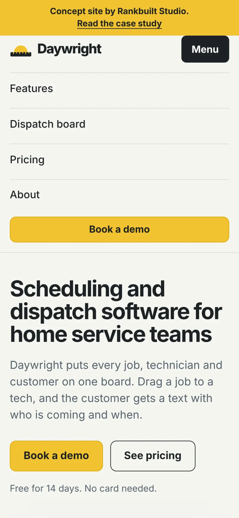
The menu 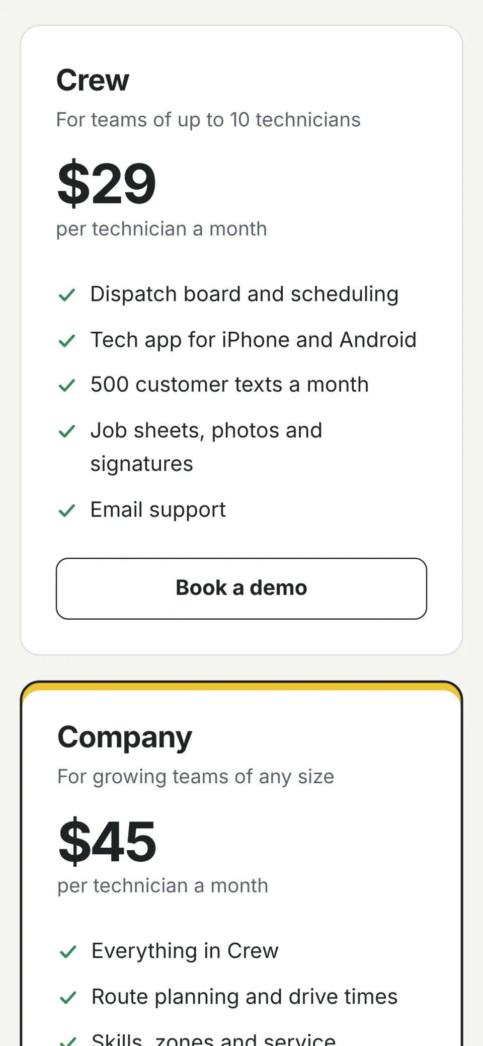
Pricing
The whole home page
Each frame scrolls on its own, so you can read the whole page without leaving this one.



09Lab tests
Lab scores, measured on the build
- 100Performance on mobile, home page
- 100Accessibility, every page
- 100Best practices, every page
- 100SEO with indexing on, every page
Lighthouse 12.8.2 lab tests on all 7 pages, 21 November 2026. Mobile figures are the median of three runs per page. These are lab tests, not business results.
Every page, mobile and desktop
The site is published with a noindex tag, because the product is fictional, so Lighthouse SEO reads lower as published. Tested again on a copy with indexing on.
Also checked on every page:
- No sideways scrolling at 320, 390 and 1440 pixels wide.
- No console errors and no requests to other sites.
- Keyboard: a skip link first, the menu closes with Escape, and on small screens the board's frame scrolls with the arrow keys.
- Works with JavaScript off, and nothing moves for reduced motion.
| Measure | Mobile | Desktop |
|---|---|---|
| Performance, all 7 pages | 99 to 100 | 100 |
| Accessibility | 100 | 100 |
| Best practices | 100 | 100 |
| SEO as published (noindex) | 63 to 66 | 63 to 66 |
| SEO with indexing on | 100 | 100 |
| Largest Contentful Paint, home page | 770 ms | 220 ms |
| Total Blocking Time, home page | 90 ms | 0 ms |
| Cumulative Layout Shift, worst page | 0 | 0 |
| Download size, home page | 14 KB | 14 KB |
10In the build
What is in the build
- 7 pages, each 10 to 14 KB to download with its CSS and JavaScript inlined, and no font or image files at all.
- Its own share image, icon and 404 page, and server rules that keep every page out of search.
- A demo form that checks every field and then says plainly that nothing was sent.
11For a real product
What a client version adds
- Use case pages for each trade, comparison pages and integration pages.
- A docs and help section, often the most searched part of a software site.
- Real screenshots or a short product film, and real customer stories with their permission.
- The demo form connected to the sales team's calendar and CRM.
Want a site like this for your product?
I build SaaS marketing sites that show the product, answer pricing questions and rank for the problems buyers search. Open the concept and see the board, or book a call about your own product.
Credits and ownership
- Daywright, Kettle Creek Heating & Air and every technician and customer in the screens are fictional. In November 2026 I checked that no software product uses the name, and any likeness is unintended.
- The prices are the concept's own examples, and no real company or brand is named anywhere on the site.
- Every product screen, the map and the logo were built in code. No photographs, stock images or real screenshots are used.
- Type: the system sans on the visitor's device.
Related
Tell me about your website
A 20-minute video call, no slides and no pressure. Bring your current site or your plan, and you'll leave with the three changes I'd make first, whether or not we work together.
Not ready to talk? Get a free video review of your site, or email hello@rankbuiltstudio.com.